Rillo - Rebranding
and Case Study

Rillo – Fintech ReBranding & Product Case Study Presentation
© February 2026

Visual Brand Identity & Packaging

© September 2025

· Brand Identity

· Visual Design

· Packaging

· Environmental

· Digital Presence

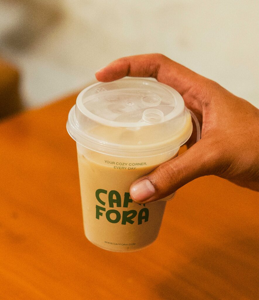
Caffora is a modern lifestyle café brand built for coffee lovers, creatives, and communities. More than just a coffee shop, Caffora is a destination for connection, inspiration, and comfort. From specialty brews to artisanal bites, every detail is crafted to deliver warmth, quality, and a sense of belonging.
 
 
Vision:
To become the most loved lifestyle café brand in Europe and beyond, where coffee culture meets creativity, sustainability, and human connection.

Logo Design

The CAFFORA logotype was designed with rounded, organic letterforms to reflect warmth and approachability.

A subtle flame/leaf-inspired symbol reinforces ideas of heat, aroma, and natural flow, tying directly to the coffee experience.

The logo performs equally well in bold signage, small packaging details, and digital interfaces.

A Brand Built for
Daily Life

CAFFORA was designed to live naturally in people’s routines.

Every interaction, ordering, carrying, sitting, and sharing was considered as part of a larger experience. The focus was on clarity, consistency, and comfort, allowing the brand to feel present without demanding attention.

The result is a system that blends seamlessly into everyday life while remaining instantly recognizable.

Hand holding a minimal branded coffee cup mockup with Cafora logo on a warm wooden background
Coffee machine pouring espresso into Cafora branded paper cup with modern green coffee cup branding mockup
A close-up mockup of a CAFFORA branded tote bag in cream canvas, with a dark green business card featuring a white logo resting on the fabric to show brand consistency across different materials.

Creating a Connected
Experience

From packaging to physical spaces, CAFFORA’s presence works as a single, connected environment.

In-store elements, takeaway materials, and branded touchpoints reinforce one another, creating continuity across moments both big and small. Each piece supports the same feeling: relaxed, familiar, and dependable.
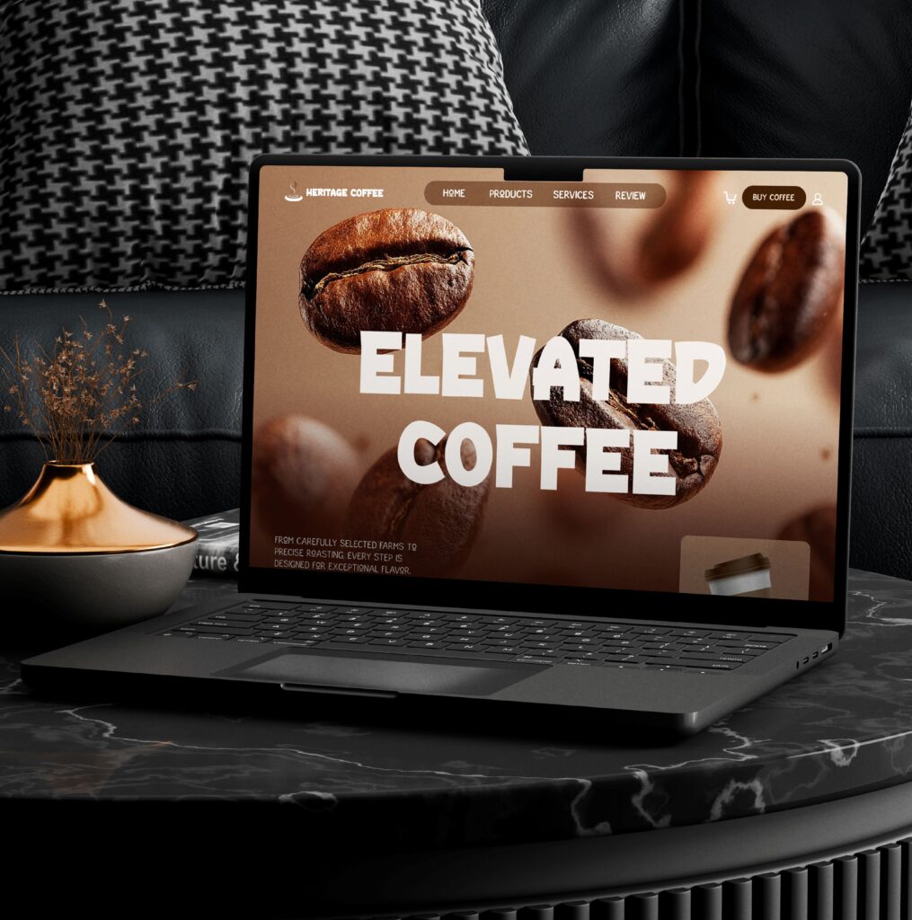
Detailed photograph of a client reviewing a printed coffee shop menu. The minimalist green and cream design displays the final menu layout, typography, and pricing for a portfolio project
A minimalist 3D mockup of a green CAFFORA branded coffee cup carrier sitting on a white cafe table next to a potted plant, showcasing custom logo design and sustainable packaging concepts.
A lifestyle mockup of a CAFFORA branded coffee cup sitting on a dark wooden table in a sunlit cafe, next to a matching green notebook and a small plant, showcasing a cohesive brand identity.

Digital Extension

CAFFORA’s digital presence mirrors the in-store experience.

The same clarity and restraint guide its online touchpoints, creating continuity between physical and digital interactions. Visual consistency ensures the brand feels familiar whether encountered on a screen or across a café counter.

Minimalist brand identity showcase for CAFFORA featuring a dark green business card with white logo, a branded coffee cup with custom typography, and a fresh coffee bean branch on a light neutral background.

Designed for Real
Environments

CAFFORA’s applications were developed to perform in real café conditions.

Menus are quick to read.
Packaging is easy to use.
Signage integrates naturally into space.

Every element contributes to a cohesive experience that feels intuitive for both customers and staff.

Hand holding a minimal branded coffee cup mockup with Cafora logo on a warm wooden background
Detailed photograph of a client reviewing a printed coffee shop menu. The minimalist green and cream design displays the final menu layout, typography, and pricing for a portfolio project
A minimalist 3D mockup of a green CAFFORA branded coffee cup carrier sitting on a white cafe table next to a potted plant, showcasing custom logo design and sustainable packaging concepts.

Extending the
Brand Digitally

The digital experience carries the same tone as the physical one.

Online touchpoints support discovery, recognition, and continuity, ensuring CAFFORA feels consistent wherever it’s encountered. The experience remains focused, calm, and uncomplicated.

A comprehensive brand identity style guide for CAFFORA, displaying the custom serif wordmark, a minimalist coffee bean icon, a natural green and cream color palette, and sample typography layouts.

A Brand That
Invites You Back

CAFFORA’s identity is built on repetition and comfort.

By maintaining consistency across environments, the brand creates familiarity over time, turning casual visits into habits and habits into loyalty.

It’s not about standing out loudly, but about becoming part of someone’s everyday rhythm.

Detailed photograph of a client reviewing a printed coffee shop menu. The minimalist green and cream design displays the final menu layout, typography, and pricing for a portfolio project
A minimalist 3D mockup of a green CAFFORA branded coffee cup carrier sitting on a white cafe table next to a potted plant, showcasing custom logo design and sustainable packaging concepts.
A lifestyle mockup of a CAFFORA branded coffee cup sitting on a dark wooden table in a sunlit cafe, next to a matching green notebook and a small plant, showcasing a cohesive brand identity.

CAFFORA emerges as a cohesive, scalable coffee brand rooted in comfort and routine.

Minimalist CAFÉ FORA billboard advertisement featuring a takeaway coffee cup and a latte with the slogans "Life is better shared over a cup of coffee" and "More than coffee, it’s your daily inspiration

CAFFORA Visual Brand Identity & Packaging

Published: 

Explore Other
Case Study