ORVIA Brand Identity Design
Overview
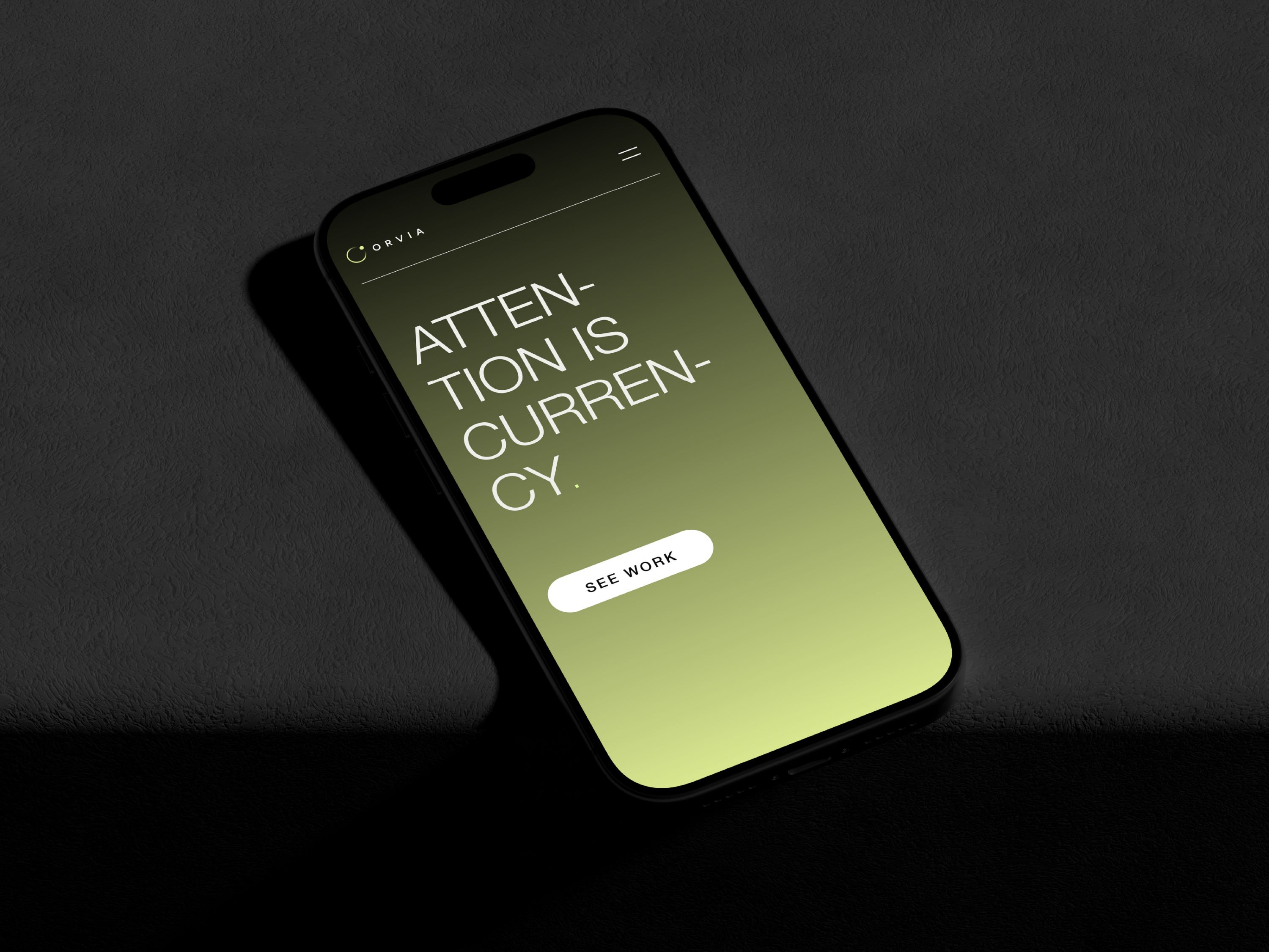
ORVIA is a forward-thinking technology and strategy brand built around a simple idea: businesses are surrounded by increasing complexity, and better decisions require clarity.
We developed an identity that reflects intelligence without feeling overly technical, futuristic without becoming cliché, and minimal without losing character.
Challenge
ORVIA needed an identity that could communicate intelligence and innovation without falling into the typical visual language of technology and AI brands. The challenge was to create something minimal and sophisticated, while still giving the brand a distinctive character that could scale across digital and physical touchpoints.
Solution
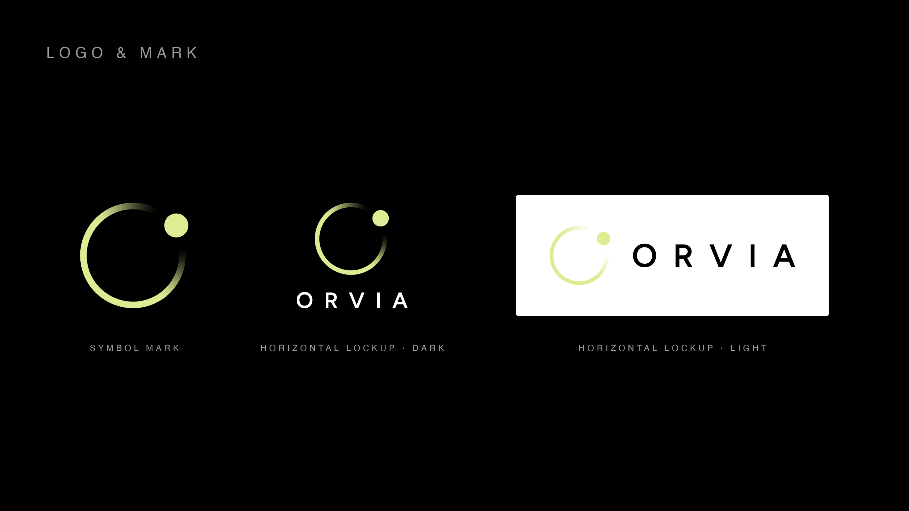
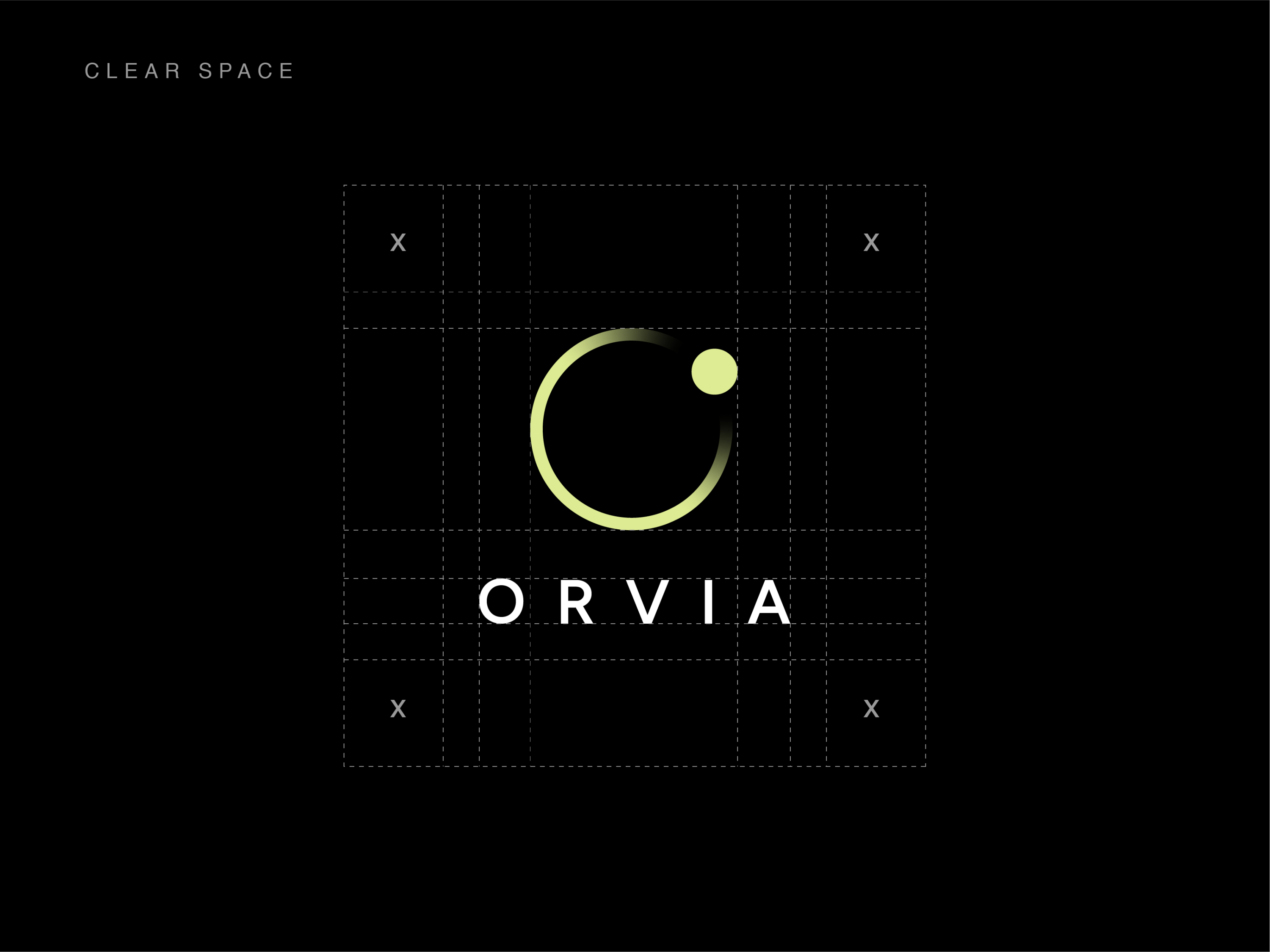
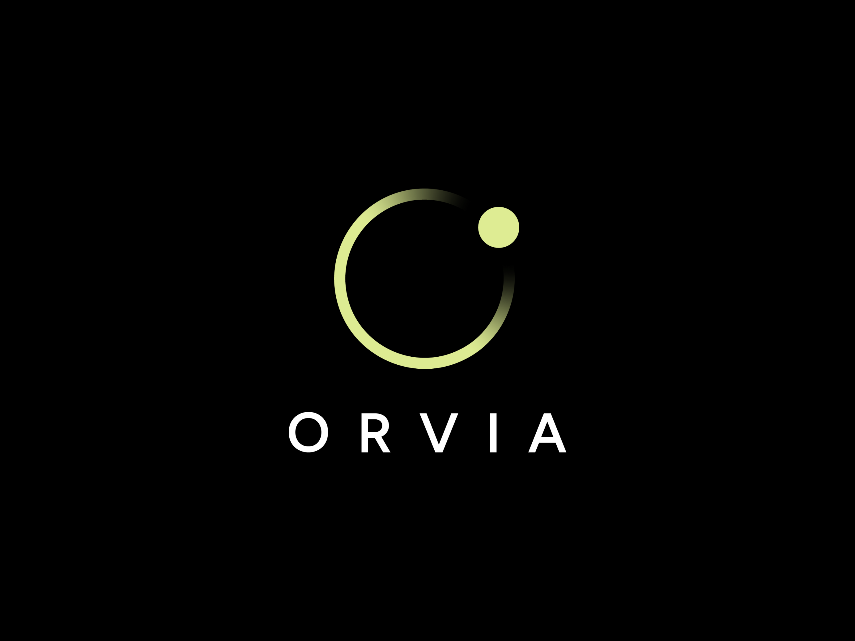
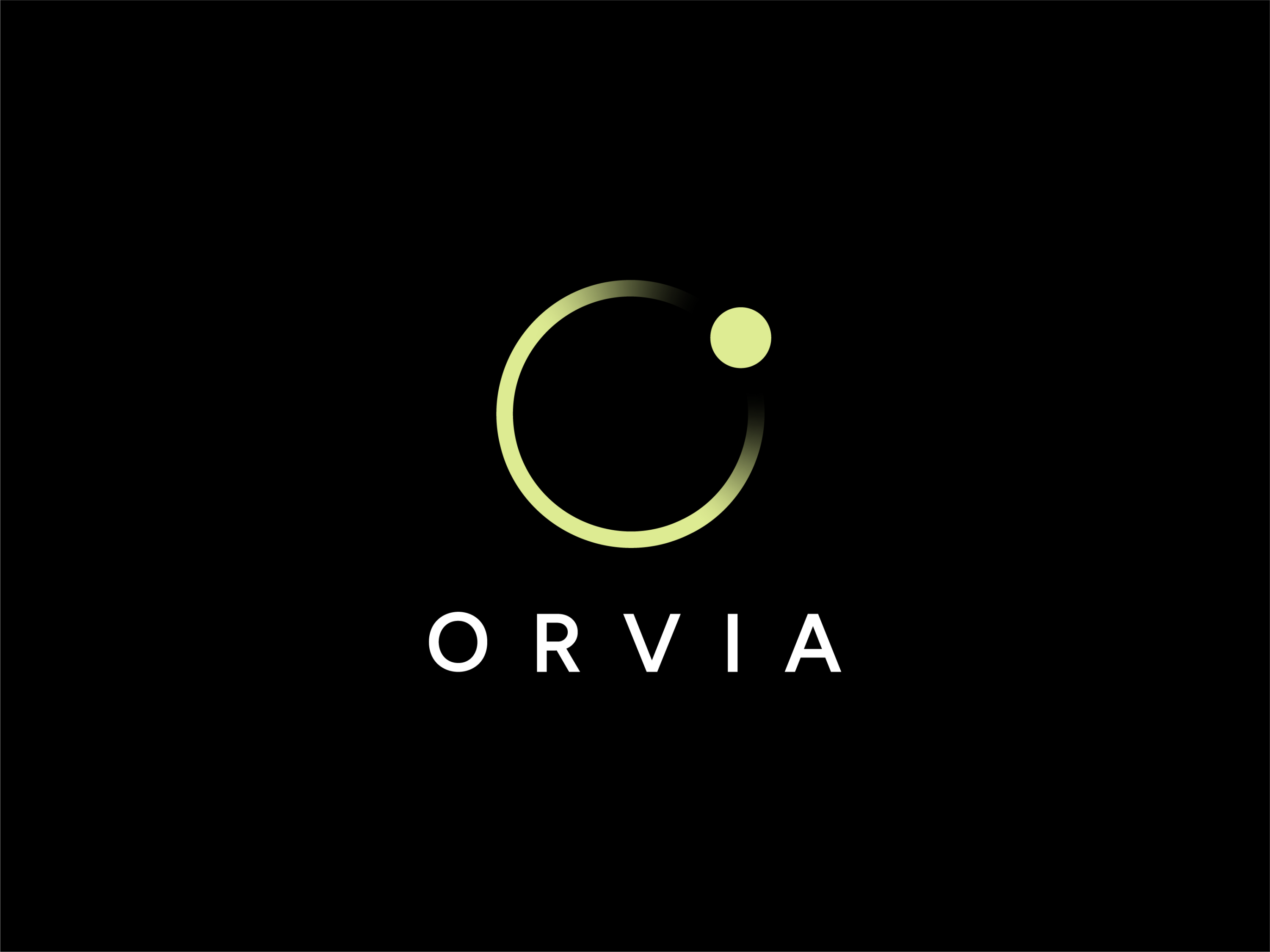
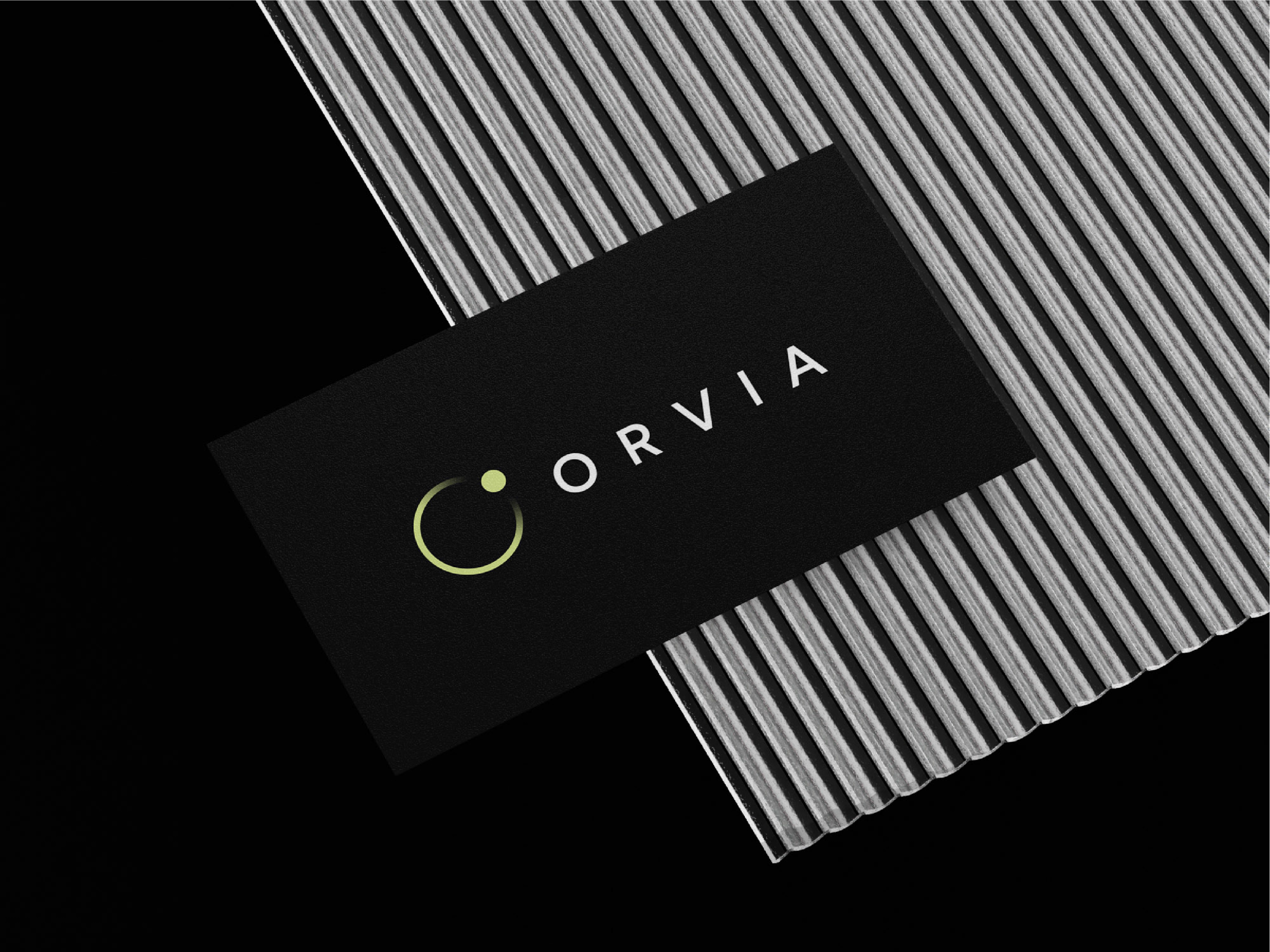
We built the identity around the idea of focus, movement, and clarity. The circular symbol represents continuity and connected systems, while the open form and focused point create a sense of direction and attention. A restrained black-and-lime palette, refined typography, and minimal visual system complete the identity.
Results
The result is a modern and flexible brand identity that gives ORVIA a strong foundation for future growth. The system creates a distinctive presence across digital products, communications, and physical environments while positioning the brand as intelligent, confident, and forward-thinking.
The Logo
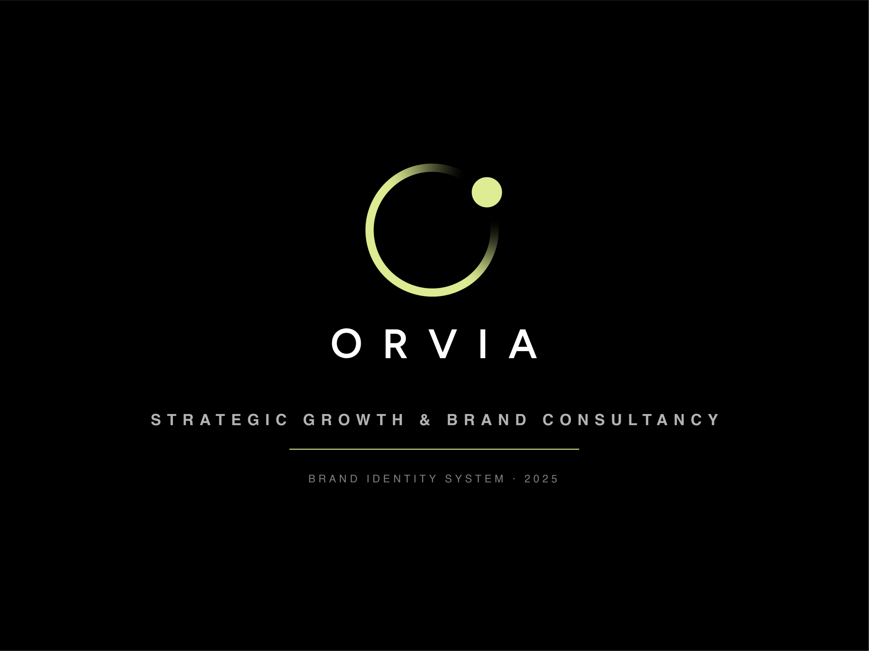
A mark designed around focus. The ORVIA symbol is intentionally reduced to its essential components.
THE COLOR
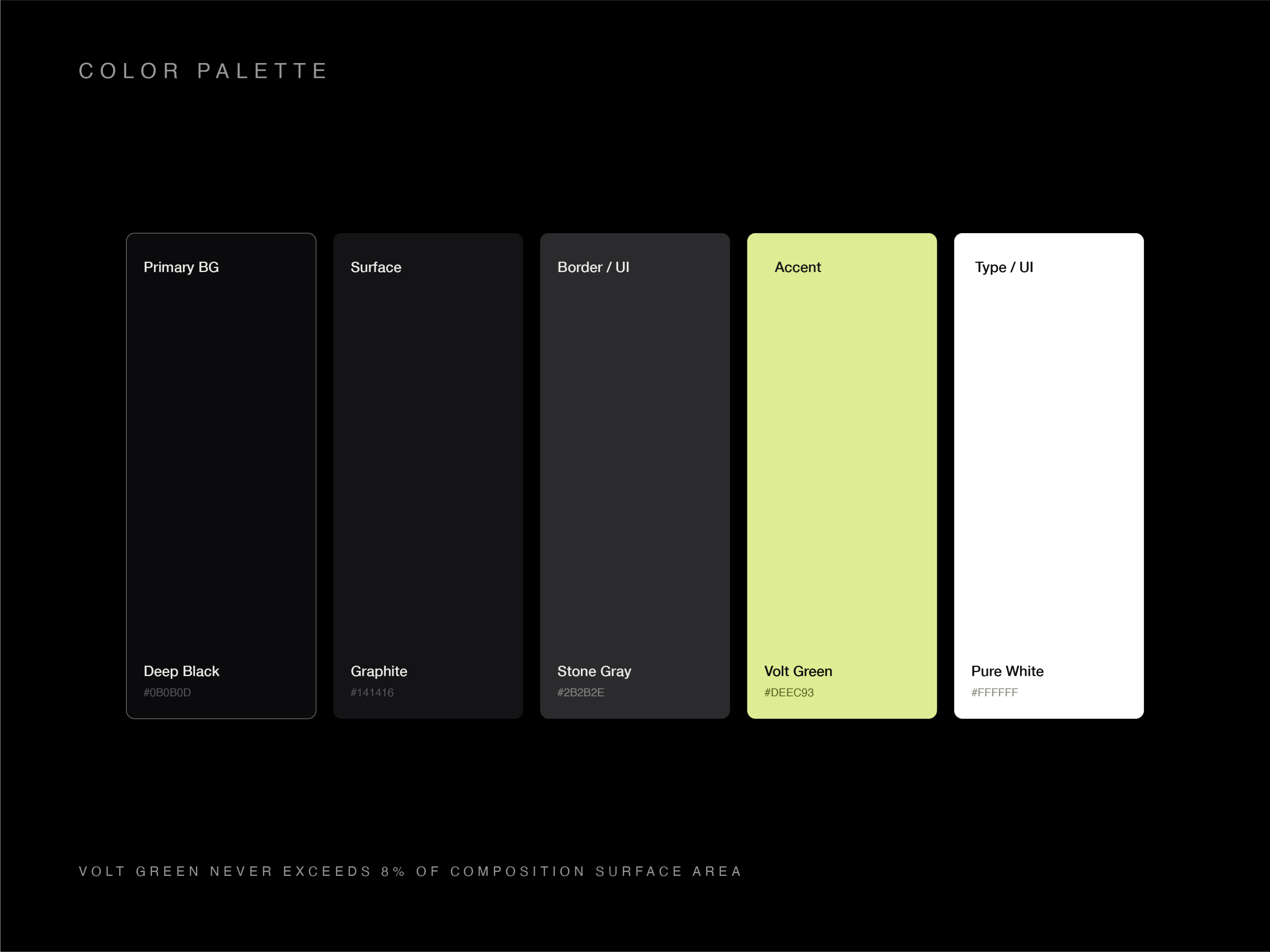
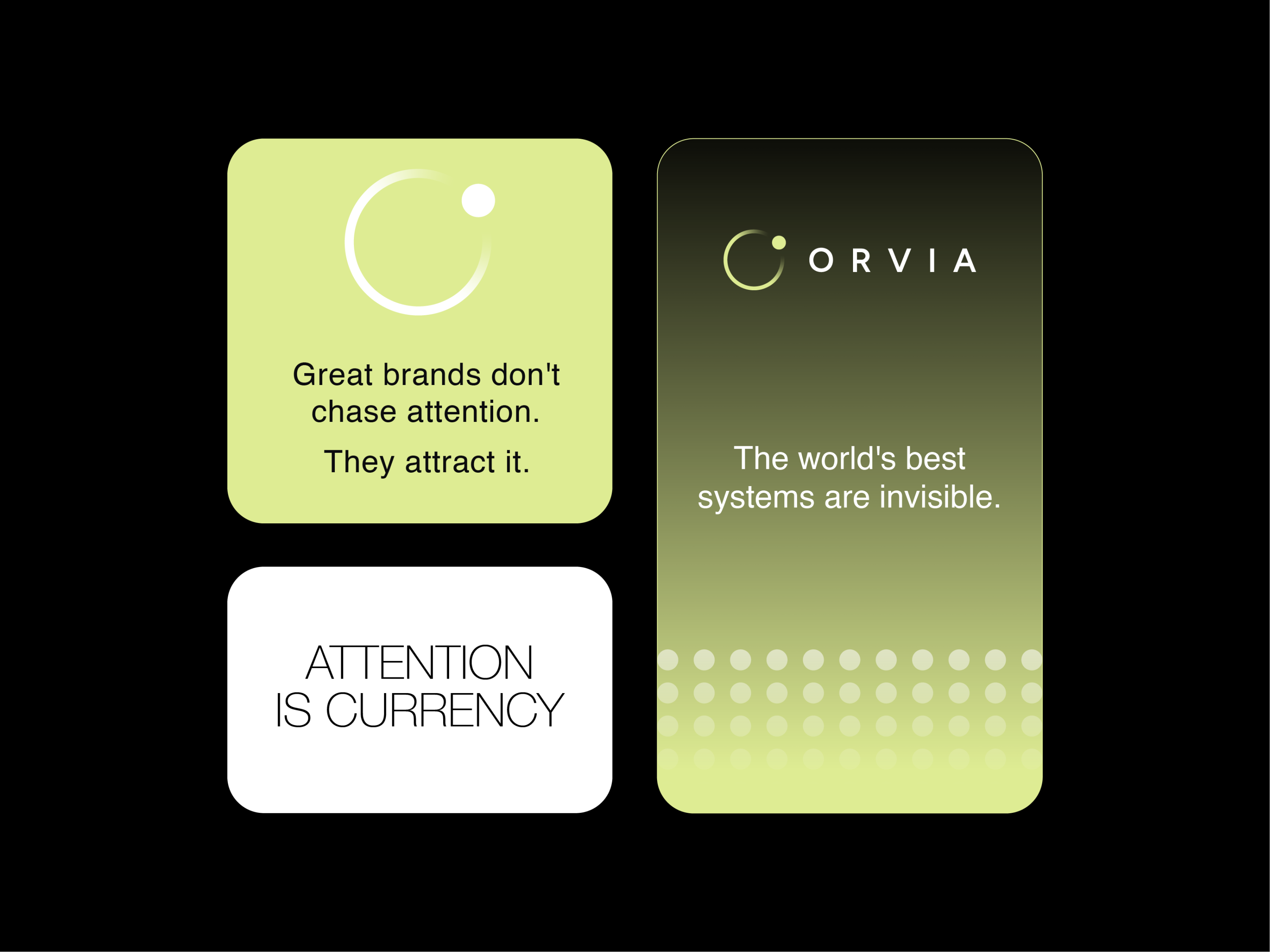
Darkness meets intelligence. The core palette intentionally avoids the typical blue-and-purple technology aesthetic.
THE TYPOGRAPHY
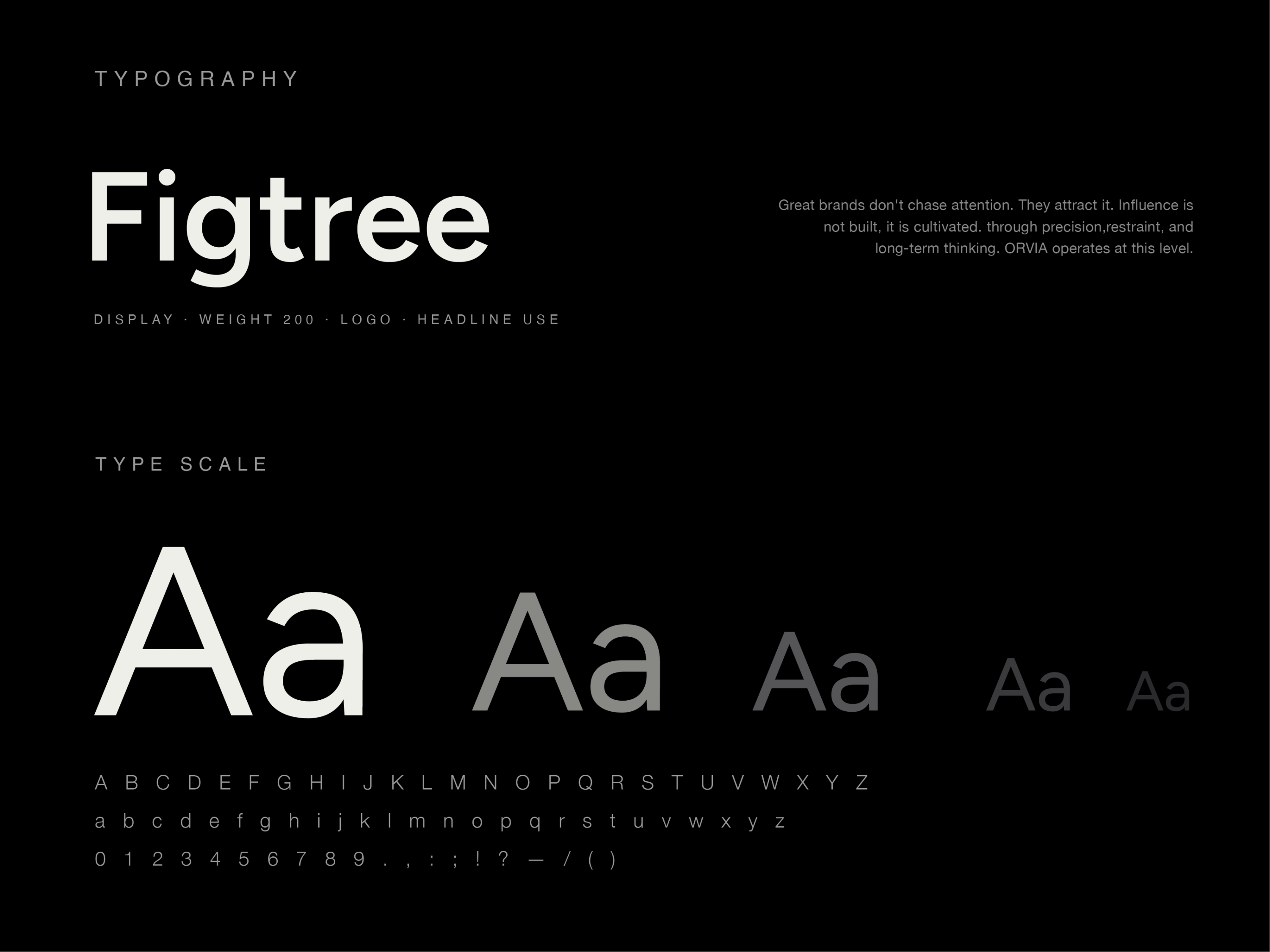
Precision through typography. The typography system uses a clean, geometric sans-serif approach with generous spacing.
Visual Language
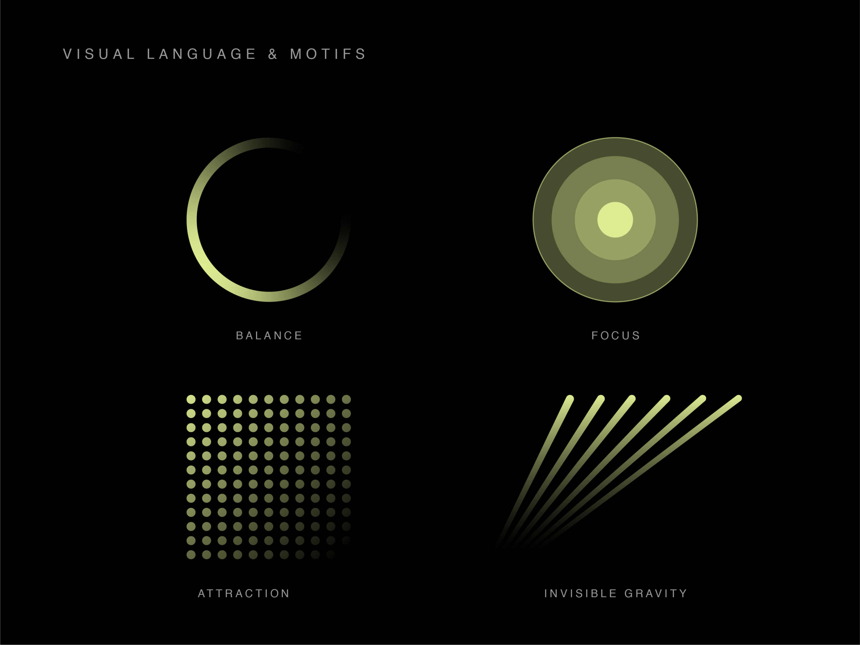
Minimal by design. Intelligent by nature. The visual system was built around a restrained palette of deep black, soft white, and an electric lime-green accent.
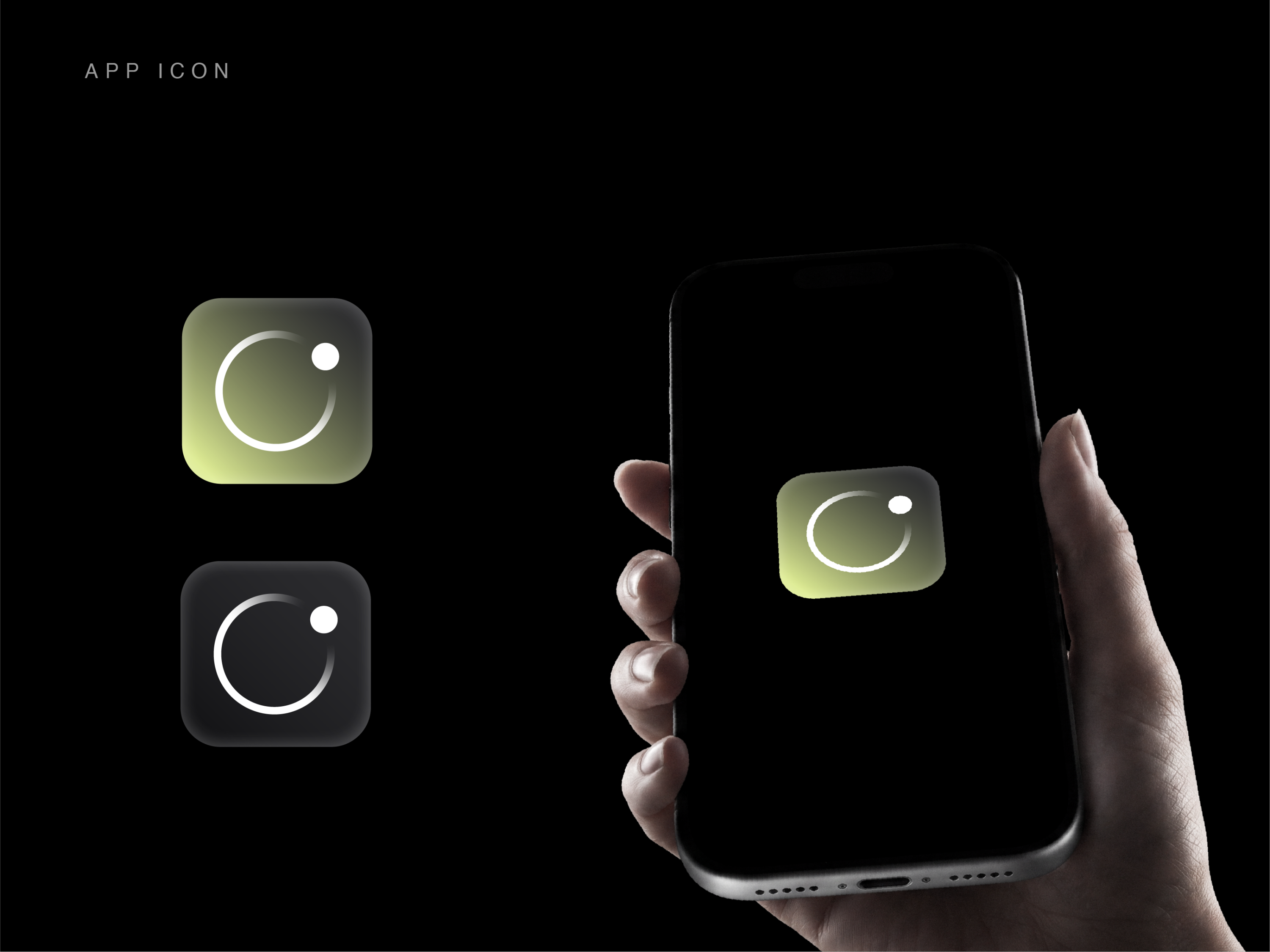
APP ICON
A focused symbol built for recognition. The ORVIA app icon distills the brand identity into its simplest form: an open circular form paired with a focused point of light.
Brand Expression
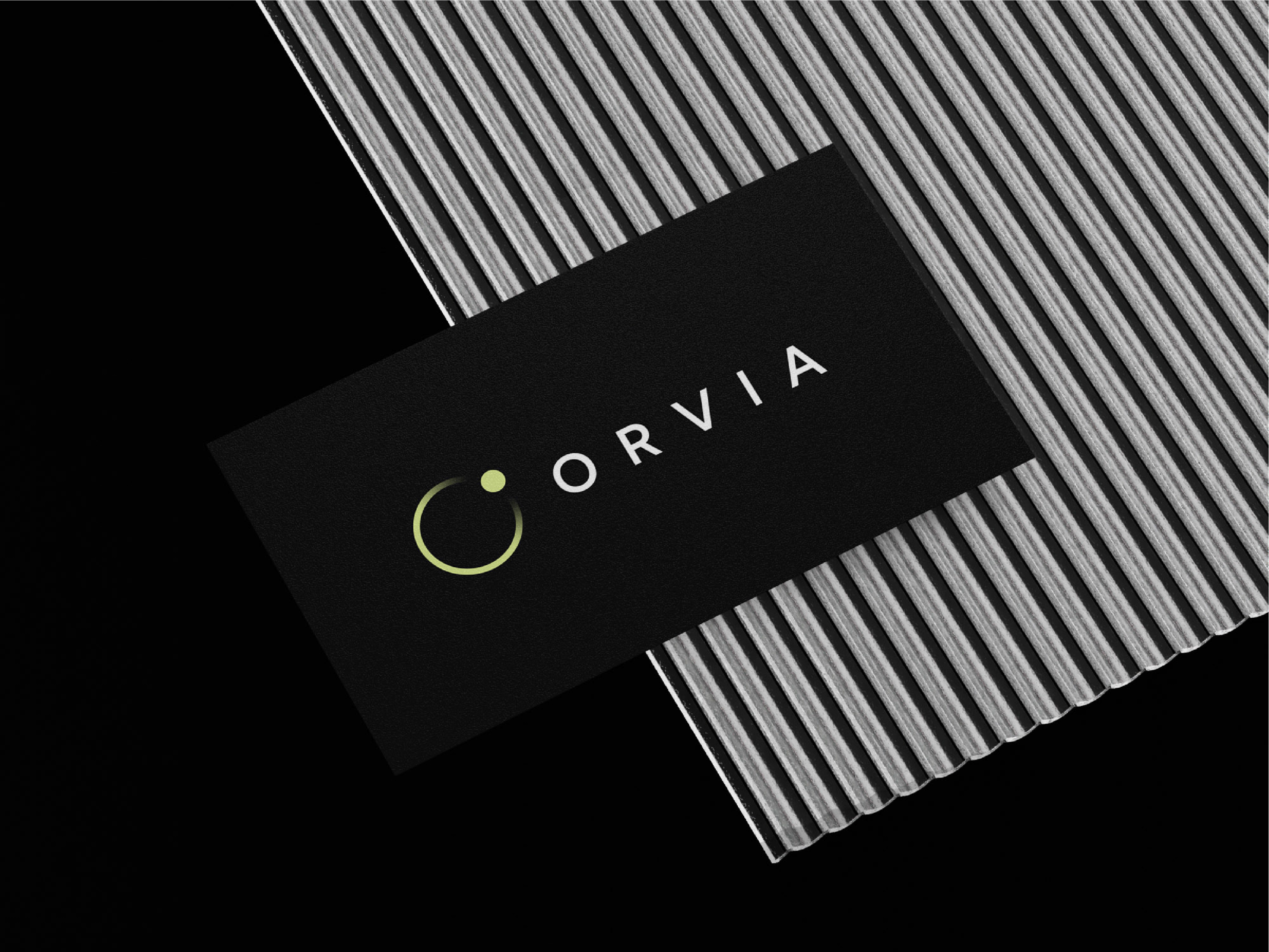
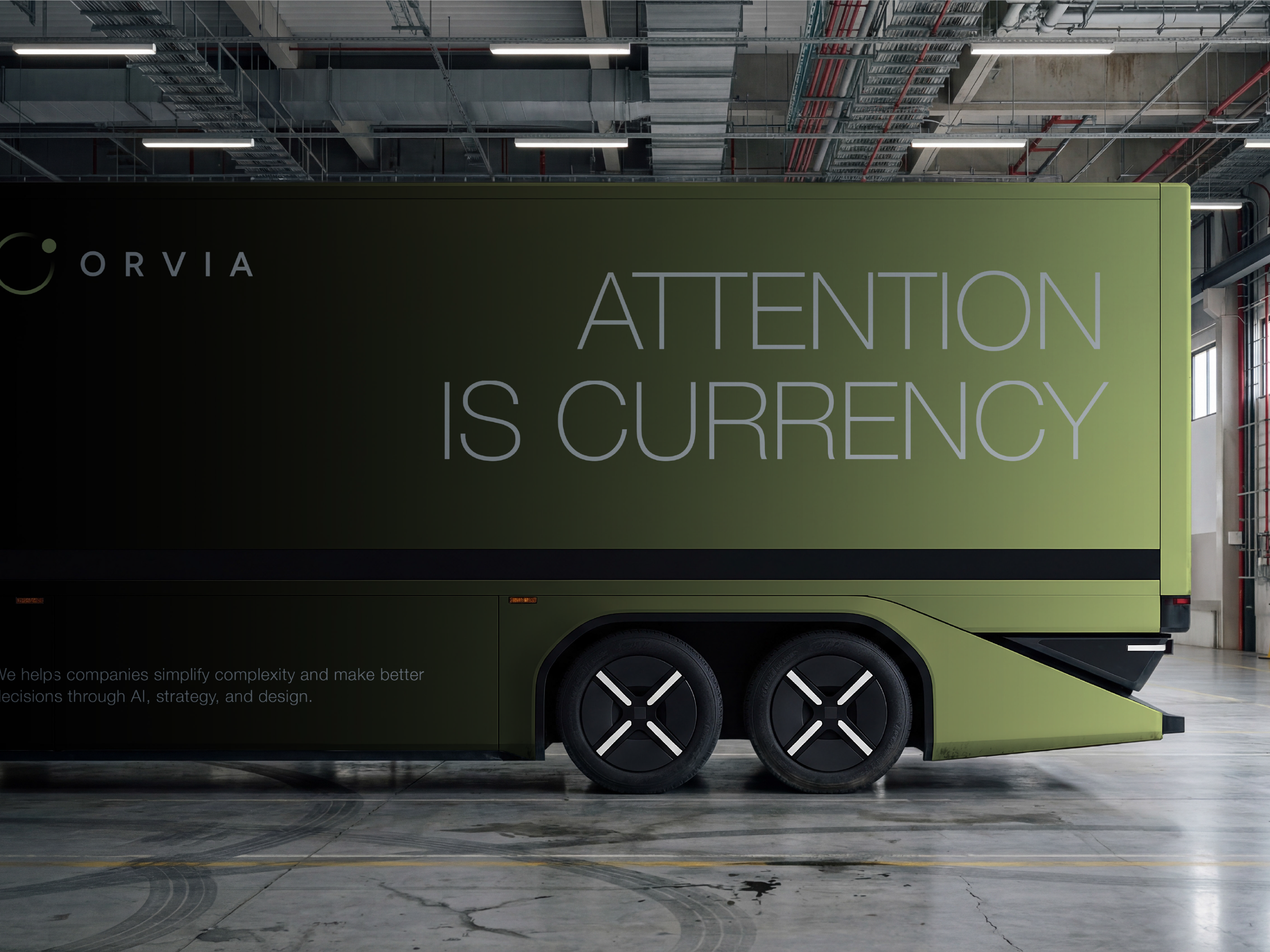
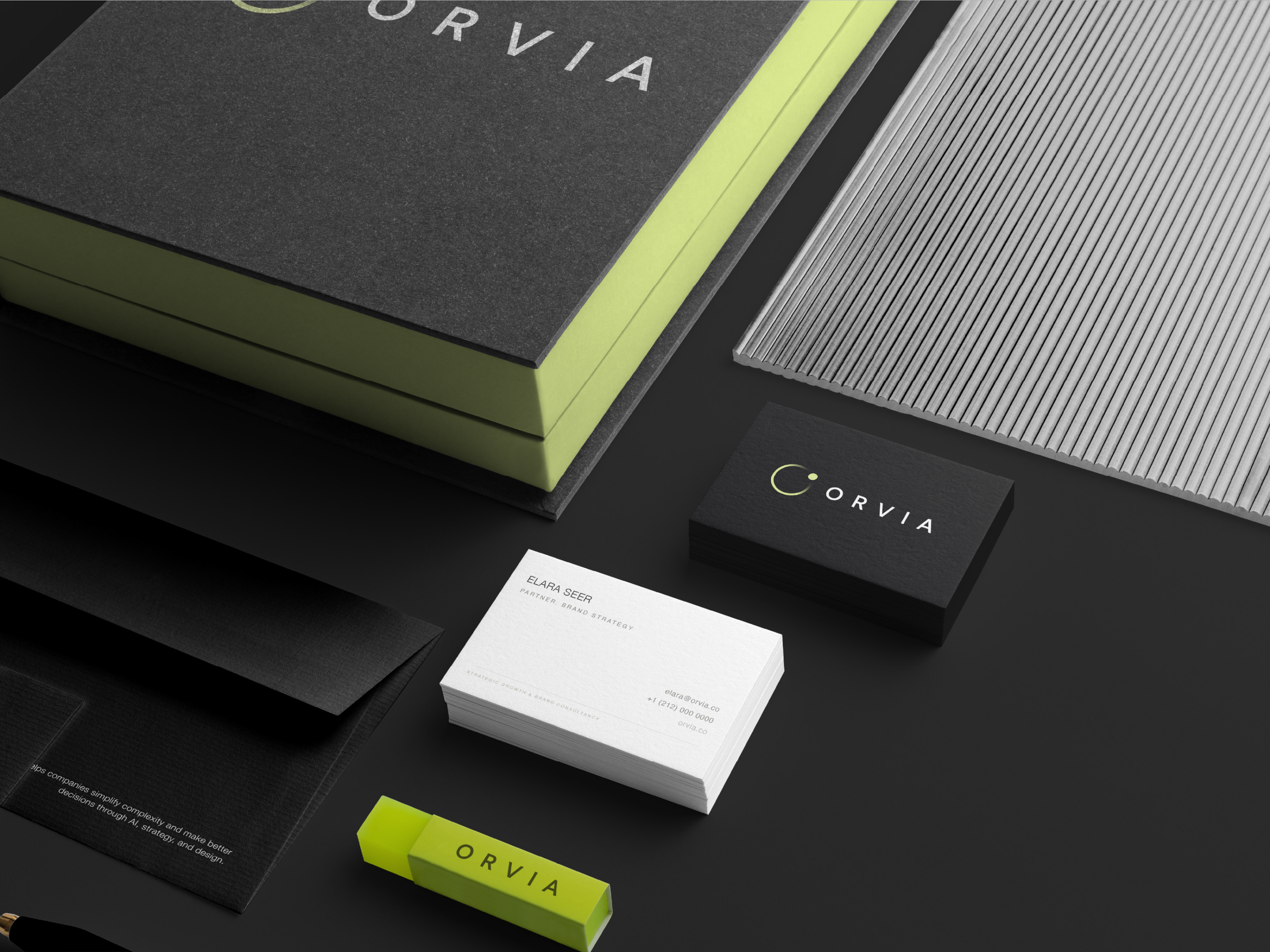
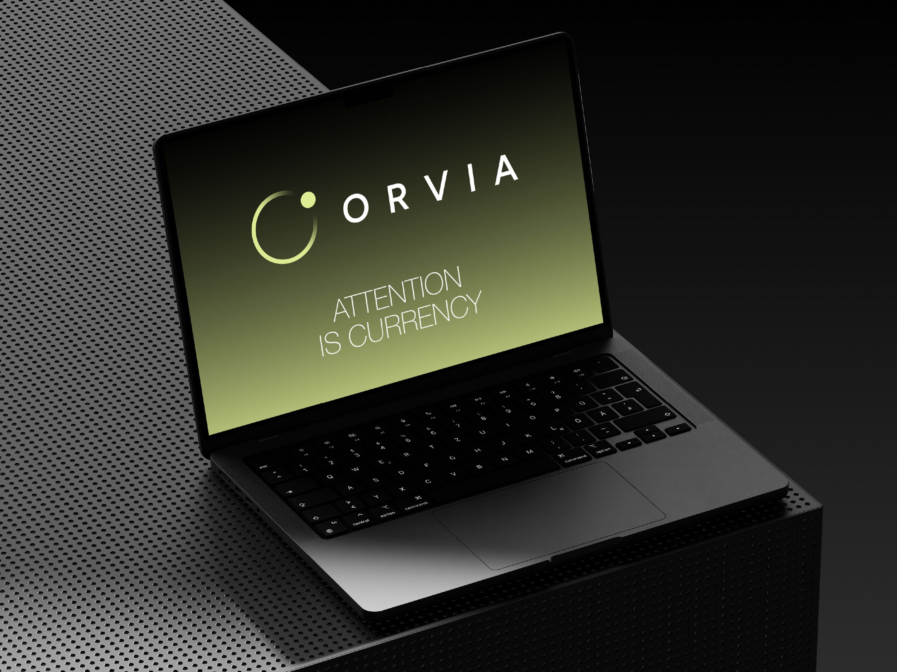
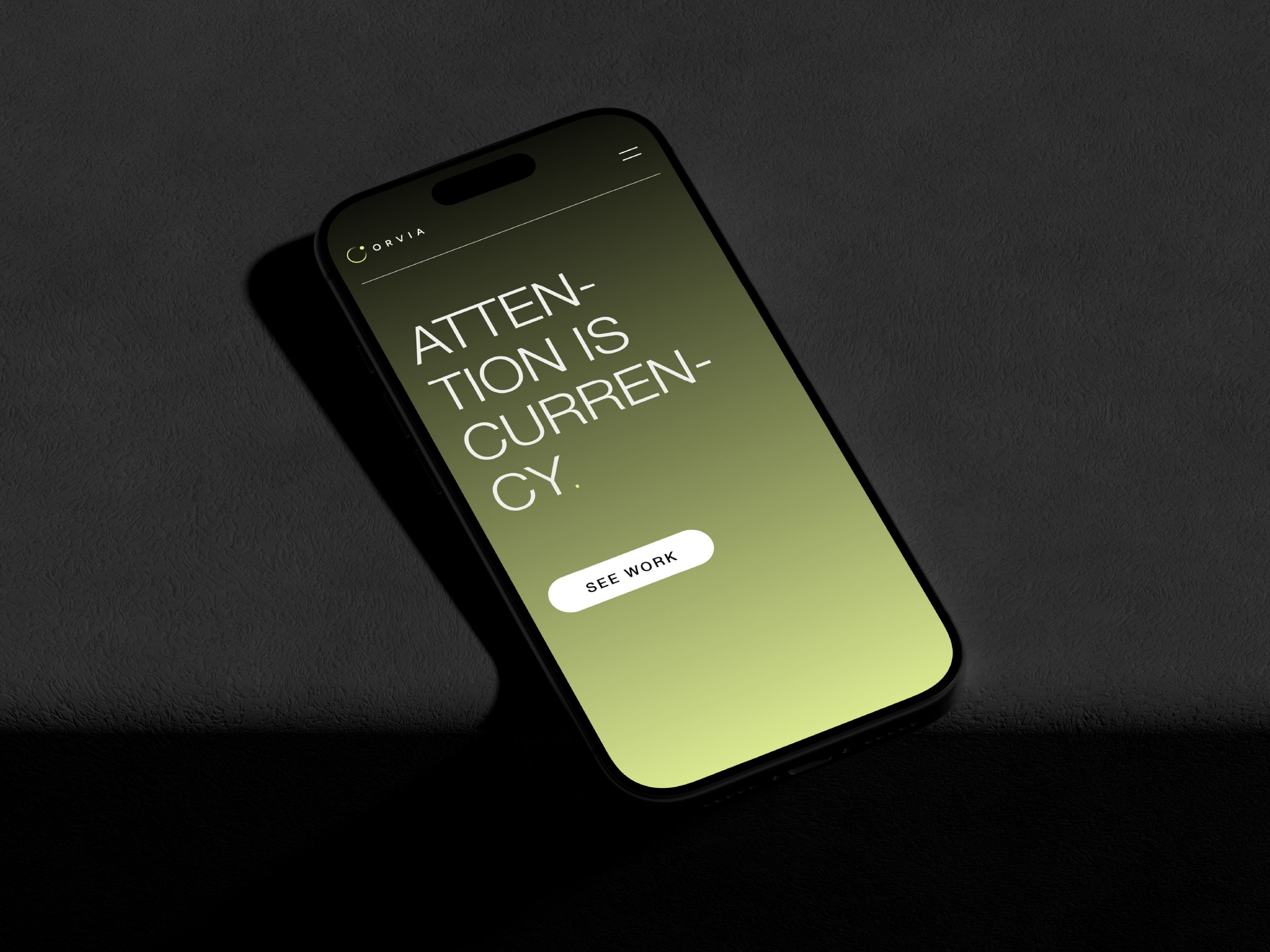
Designed to exist beyond the screen.
Start Your Project
Ready to Build
Something Remarkable?
Discover how we've helped other ambitious businesses transform ideas into memorable brands and digital experiences.